Conceptual project
Client: TOJOY Work: Branding, Packaging
Location: Shenzhen, China
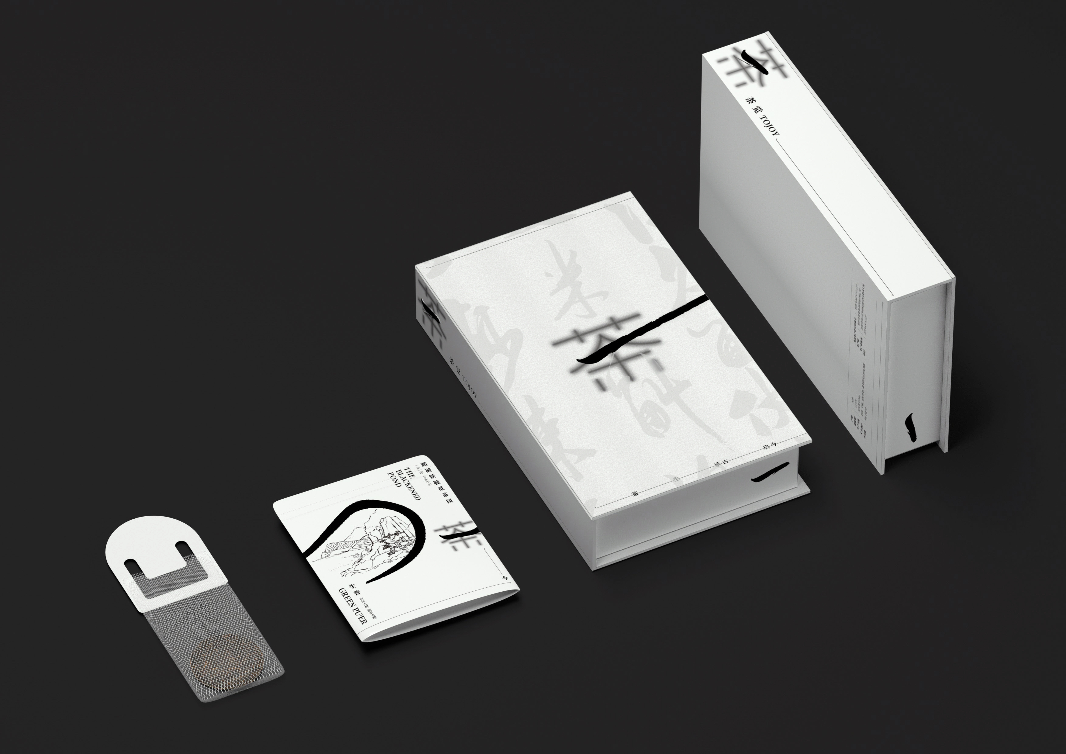
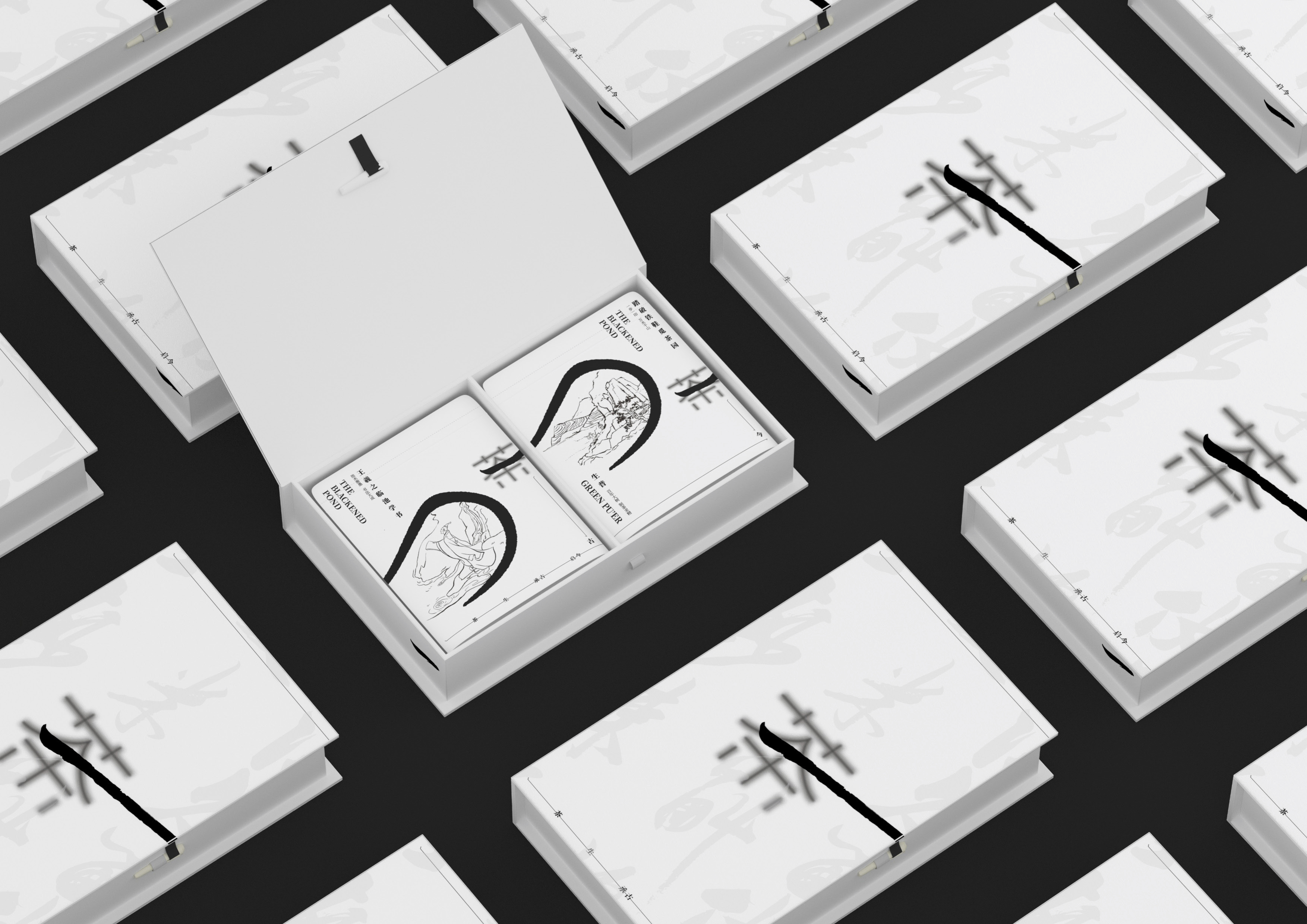
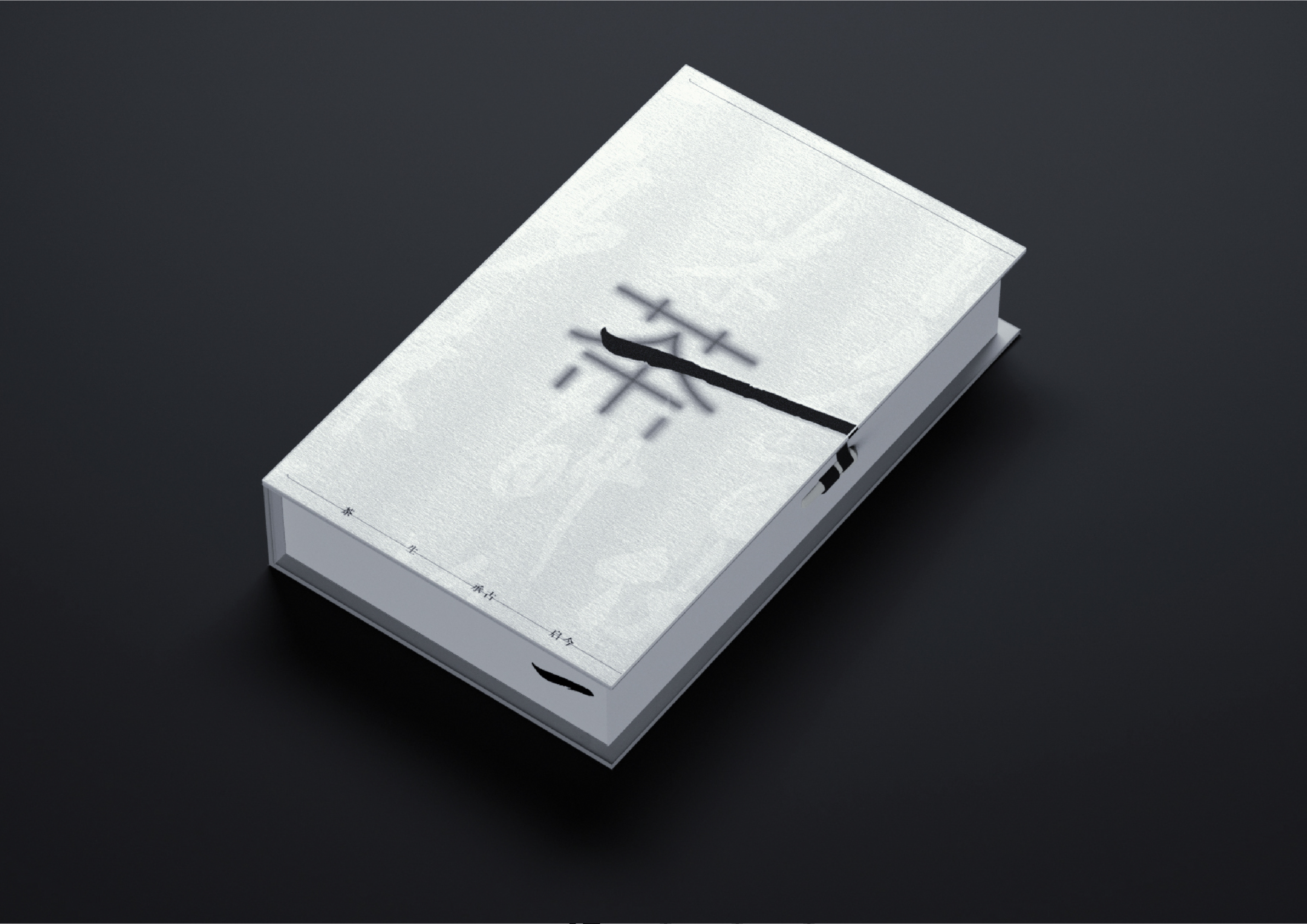
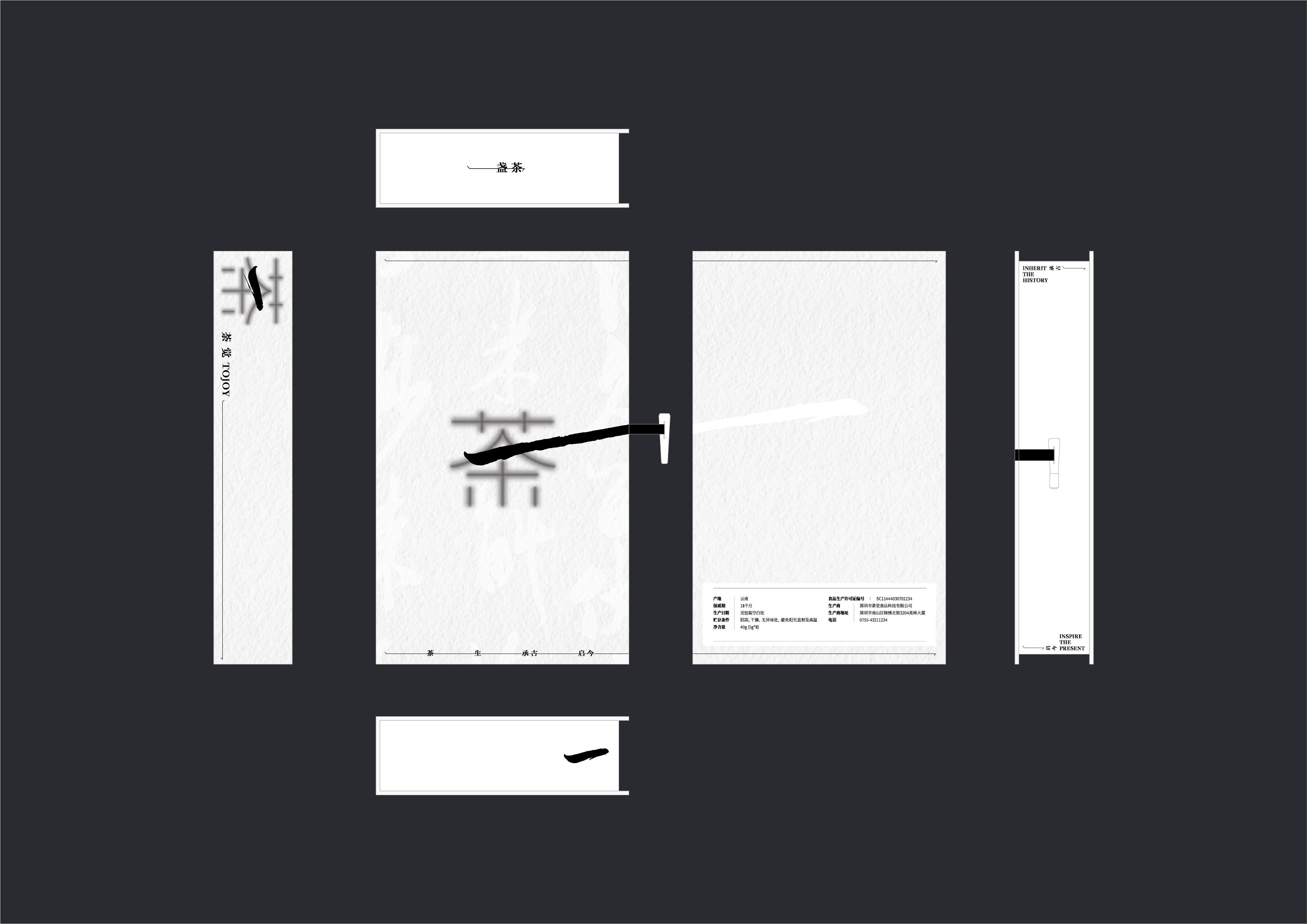
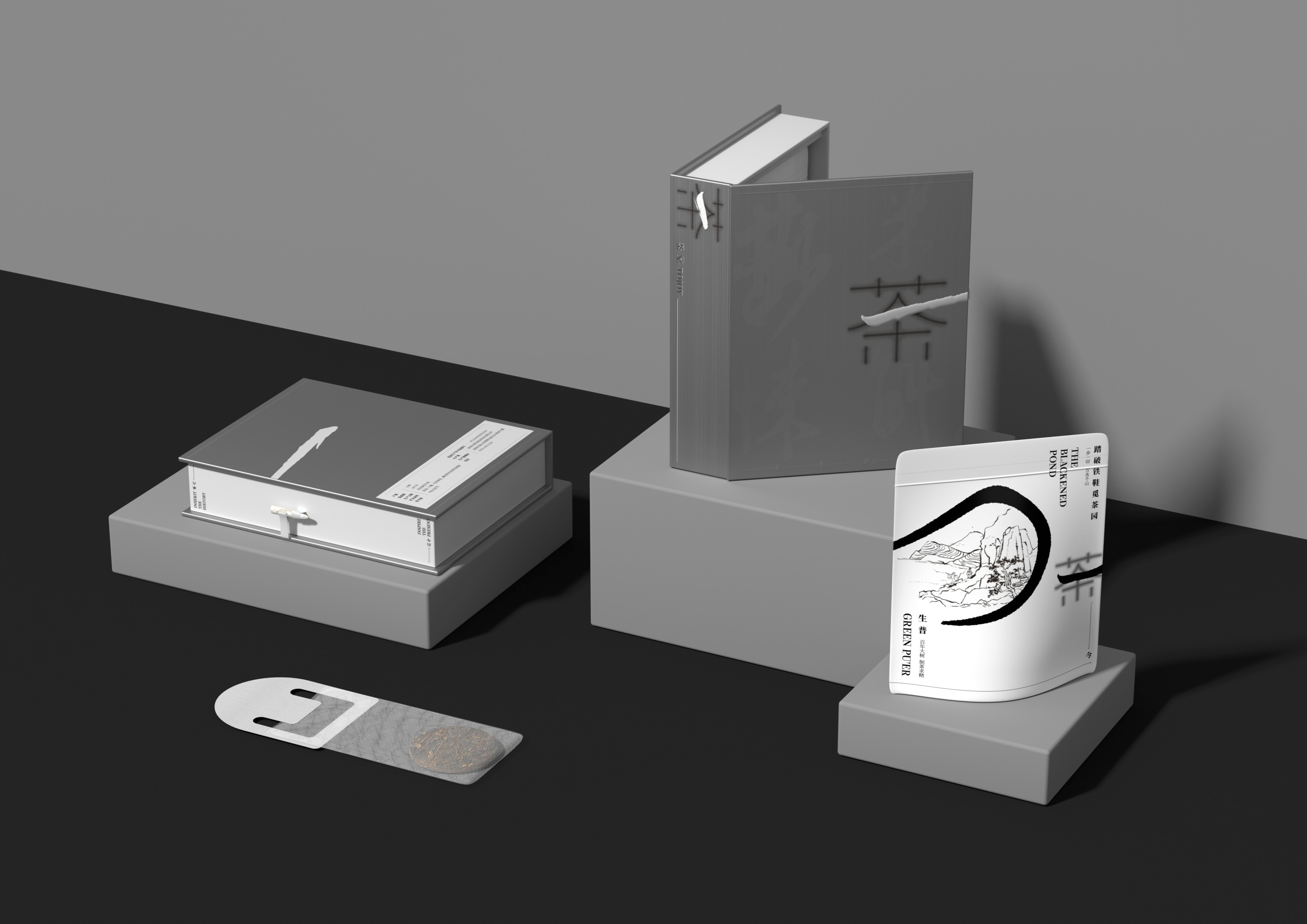
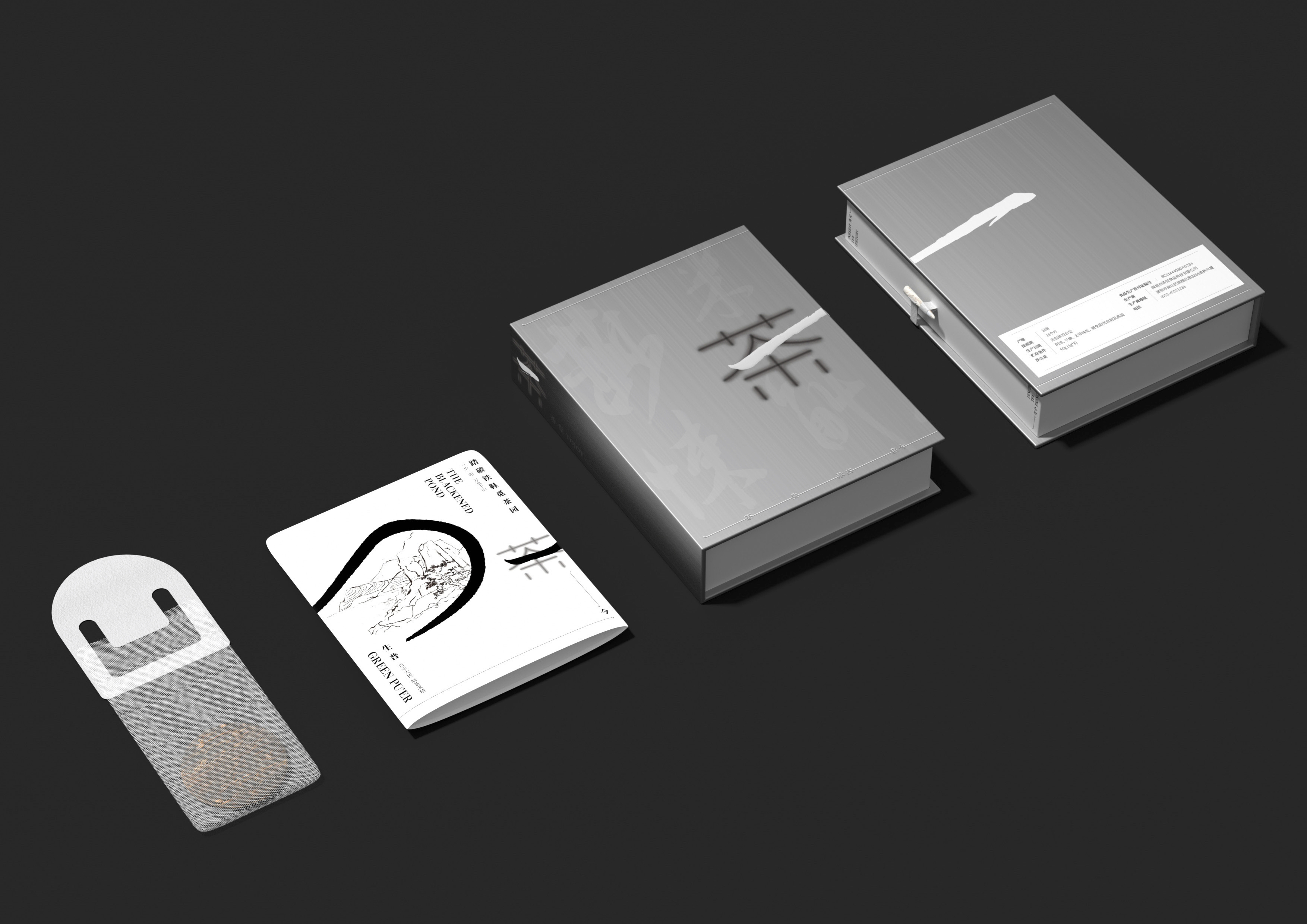
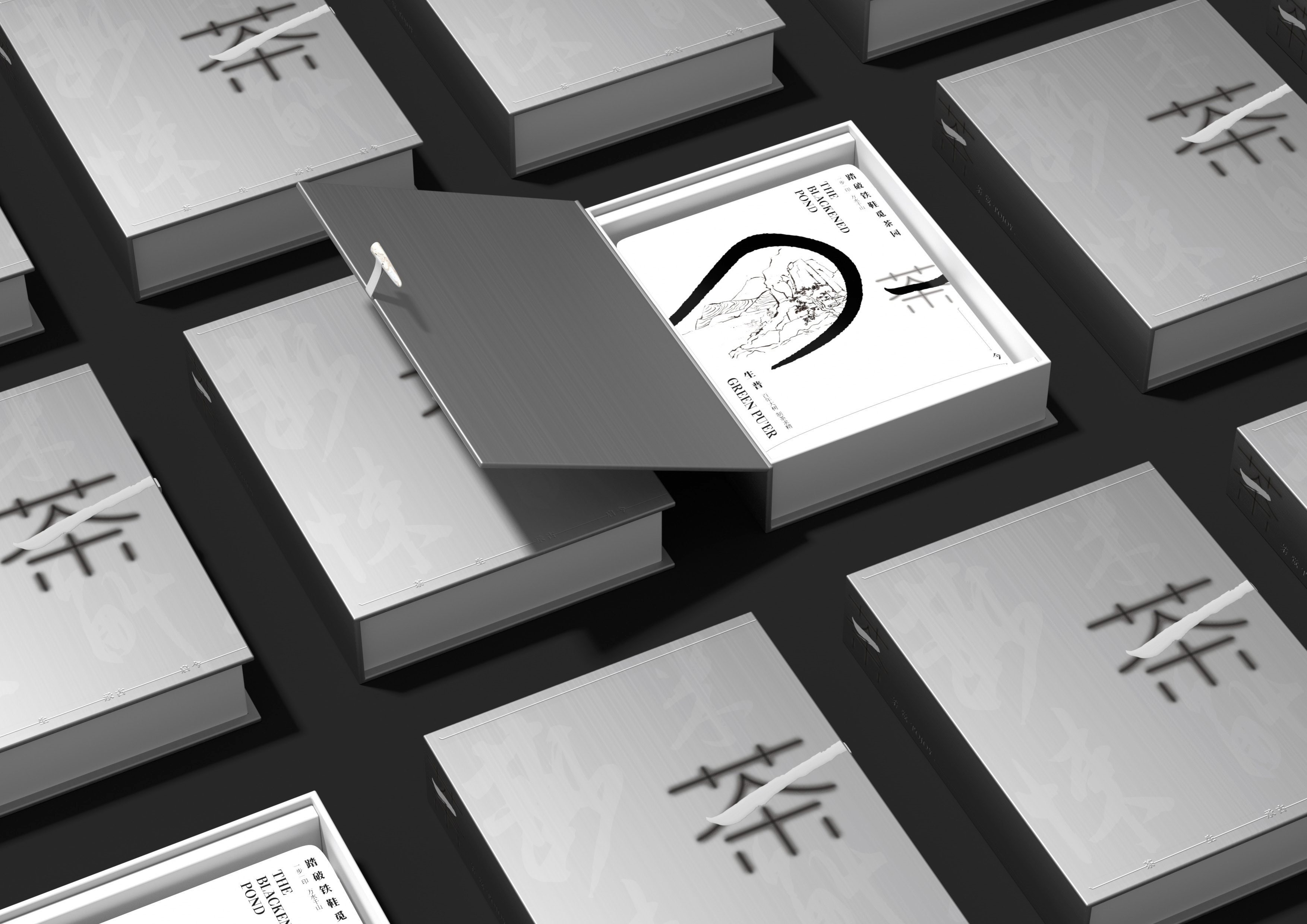
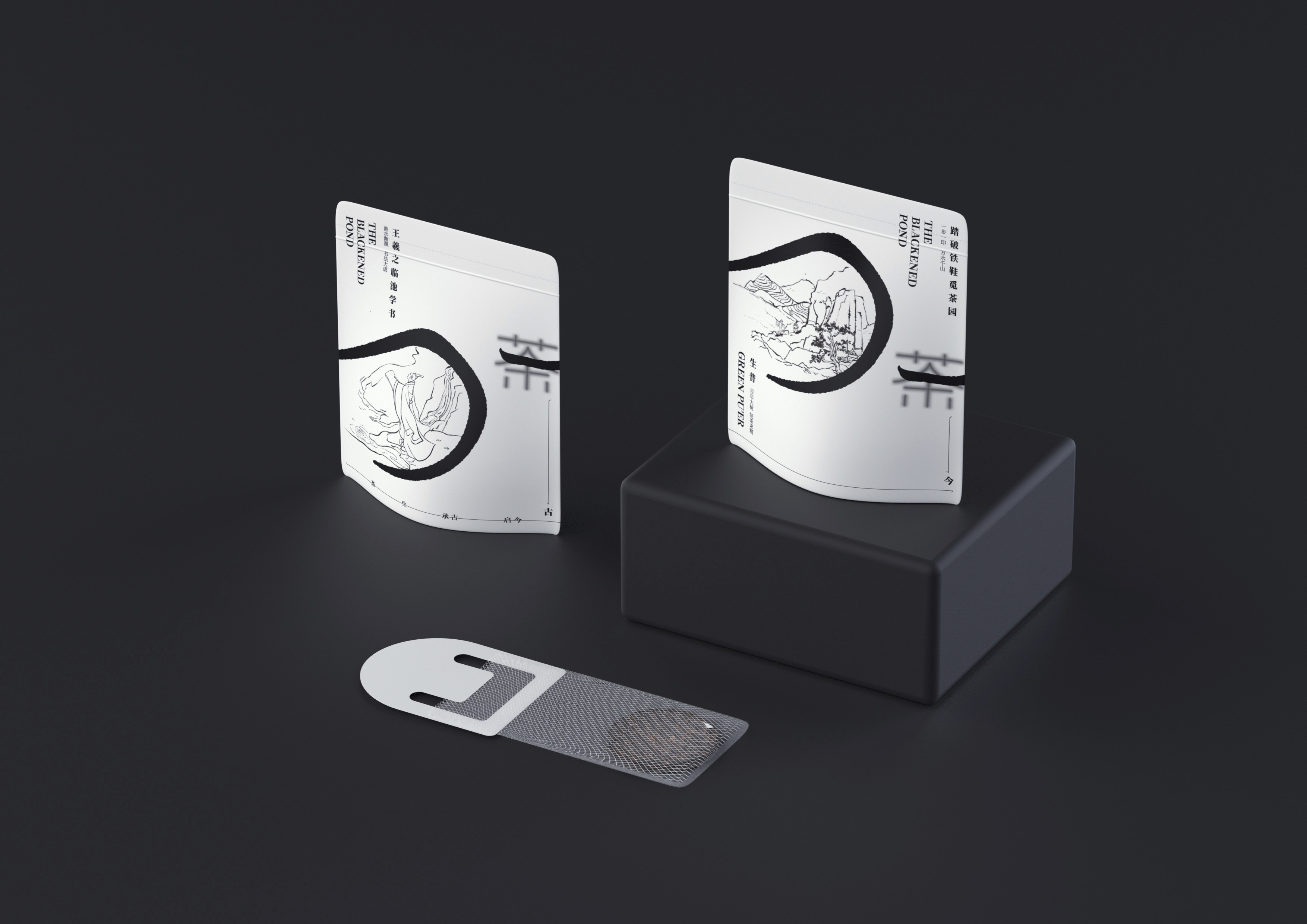
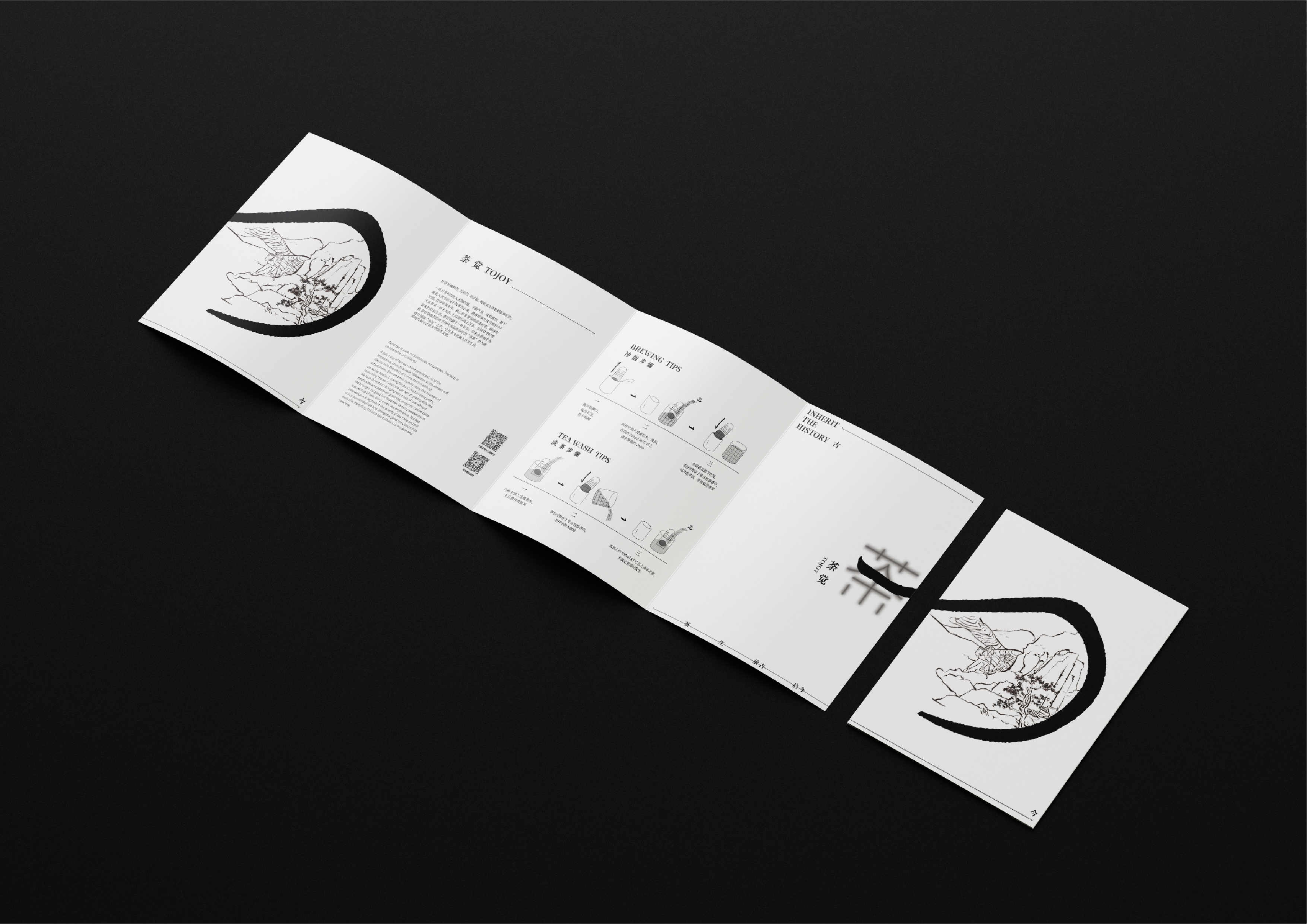
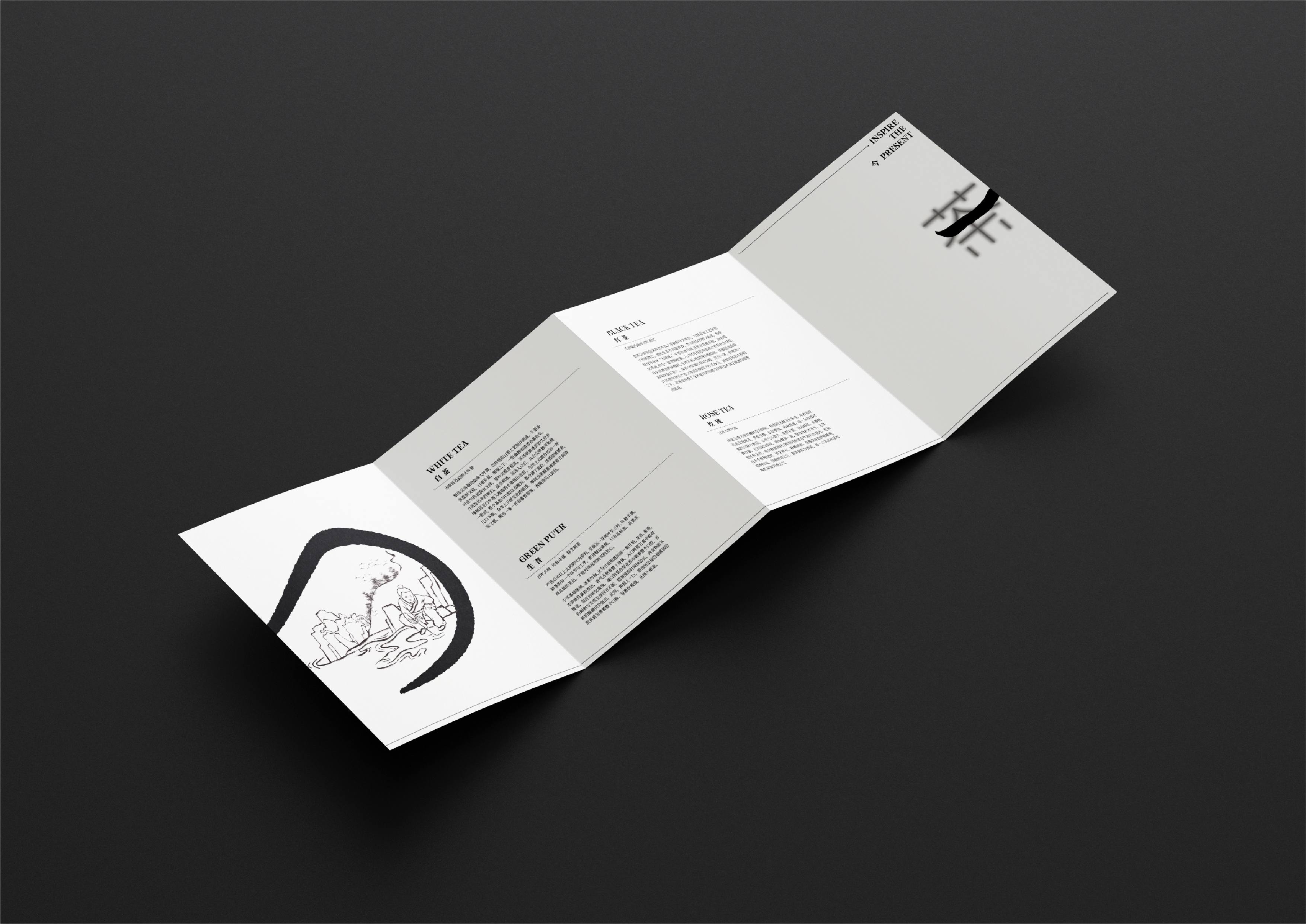
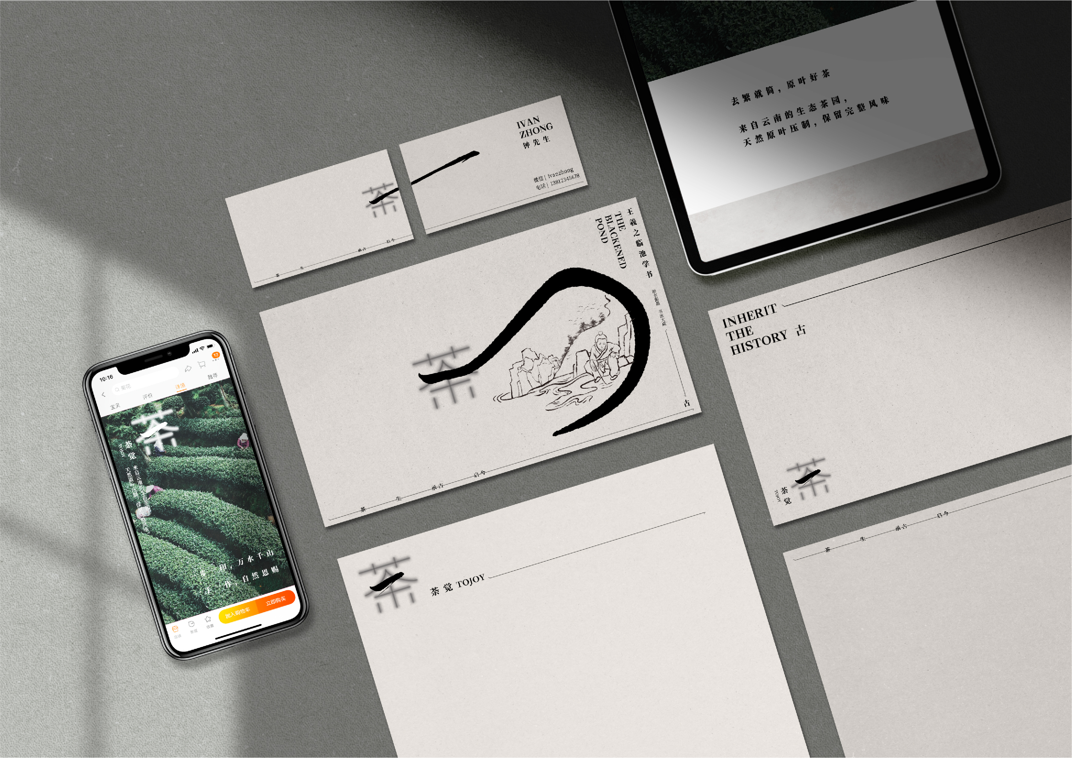
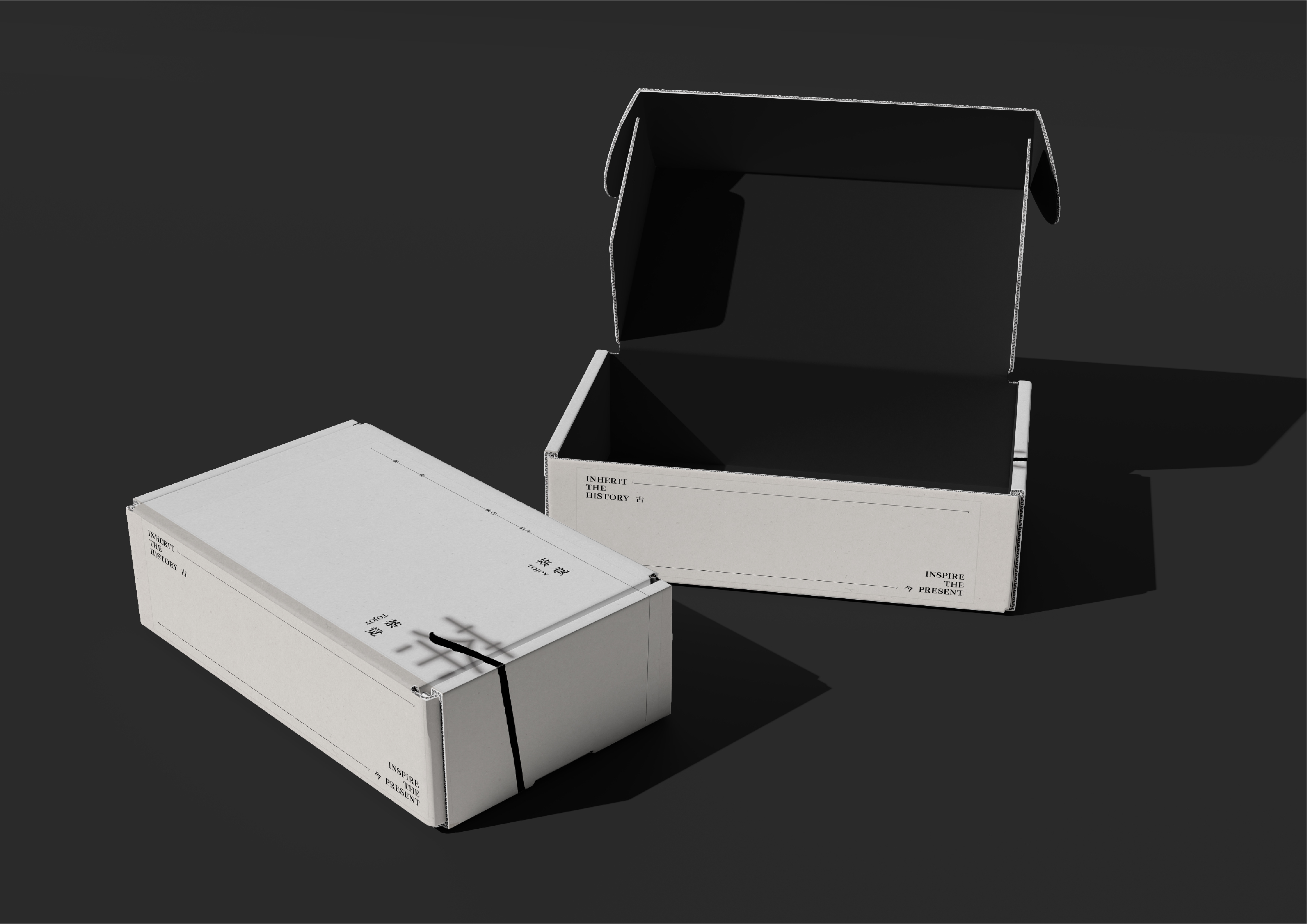
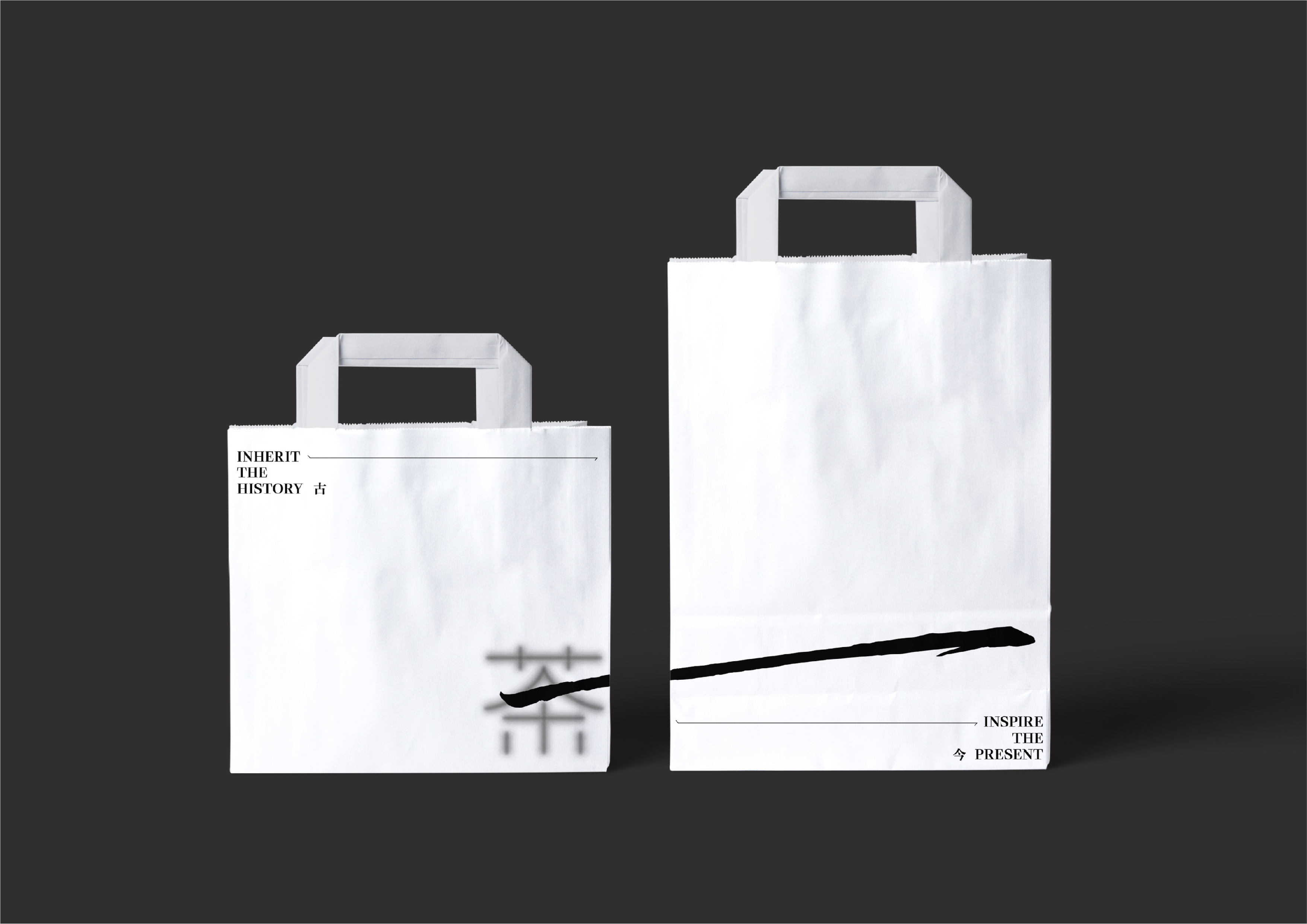
TOJOY is a neo-Chinese style tea brand. By exploring TOJOY's cultural heritage and dedicated and professional team genes, the brand is analogous to the spirit of ancient Chinese literati. It leverages its influence to shape the brand's market impression. The logo deconstructs the brand name's Chinese character "荼" (tú). The word "荼" has one more stroke "一" in the middle than the word "茶" (tea/chá). Using the Chinese character "一" (one) as a visual symbol, combined with the form of calligraphy and ink, it not only expresses the brand's persistent pursuit of making tea professionally and insisting on making "more" but also contains the spiritual core of inheriting the spirit of the ancients and inspiring the way modern people drink tea.
When "one" is extended, it can be used as a line, rope, or tie, which can connect different parts and connect "ancient" and "present". "One" can be used as a container after being bent and extended and as a frame to carry allusions, illustrations, promotional slogans, etc.
